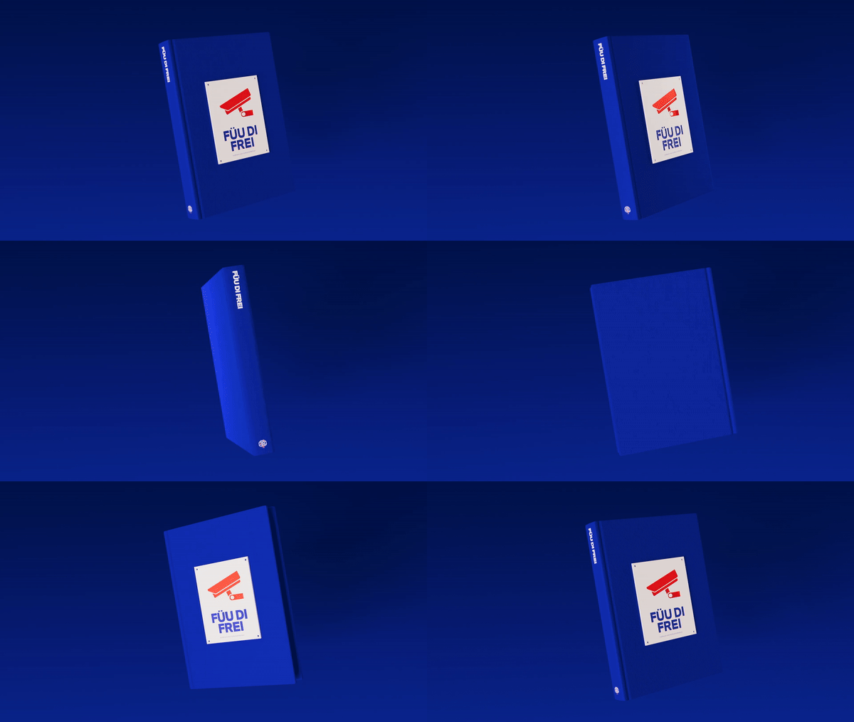
‘Füu di Frei’ (Feeling Free) narrates the story of a group of writers whose connection transcends the ordinary. They share the same goal: to challenge the status quo. Their impulse for breaching barriers knows no limits, and it helps them face extreme situations, such as exploring train depots at -11ºC, going through mental breakdowns, and escaping from trains in motion. Their search for freedom redefines the limits and questions their sense of risk in an environment that demands continuous adaptation and resistance.

In this context, the story reveals its Second Life, a B-side that confronts a judgemental society on those who think differently. It is by hiding their identity that the writers observe the daily routines from a whole new perspective and transform transgression into an act of authenticity that challenges the norm.

‘Adversity means defiance which translates into a deeper meaning of life. Even if it causes pain at times, it is essential that we cultivate hope and trust in our ambitions. Graffiti, more specifically train graffiti, means much more than aesthetics; it is a way of living and a passion that motivates us to achieve our goals, even if they may seem unreachable. It acts not only as an incentive for creativity but also works as a vehicle of resistance and expression day after day, fight after fight. Every intervention on the trains leaves a meaningful mark and symbolises a personal and collective journey in search for recognition and authenticity.’
Mark Madness.

Mark Madness is a documentary photographer and a project editor. In 2021, he published ‘Barcelona Showdown’ thanks to the tremendous work he and his team carried out and a fantastic Verkami crowdfunding campaign.
He is now presenting his new work, ‘Füu di Frei’, a piece that aims to break barriers by being launched in two different formats: an exclusive book and a short movie in the making. Given his experience behind the camera and at editing, Mark merges photography and videography and offers a one-of-a-kind visual and narrative proposal. With this project he is taking his art to a whole new level.


Ana Baenas joined Blood & Madness and contributed her exceptional ability to combine editorial design and visual narrative. With an intuitive perspective and an innovative approach, Ana tackled ‘Füu di Frei’ as an opportunity to explore its visual identity and to build an atmosphere that reflects its nuances. Her talent for integrating visual and typographic elements translates into an enveloping dimension where every choice enhances the different emotional and aesthetic narratives.
Her attention to detail helps Ana redefine the different visual aesthetics and generate a cohesion that encourages the audience to dig down into the story. Her work translates into a distinctive type of design and captivates the spirit of ‘Füu di Frei’ by transforming it into a visual experience full of symbolism.

‘Füu di Frei’ represents the beginning of a unique project that combines videography and photography and that turns it into a creative dialogue never seen before. The audience now has the chance to get to the heart of the narrative through an exclusive book, while the short movie is still under construction to offer the best possible quality. This format serves as a prelude that makes it possible to explore the story in depth and appreciate details that enrich the narrative. First, the book; then, the short movie, which will transform the audience’s imagination into a moving reality.

The book is not just a complement, but also a key piece of the project, and it is being launched as a limited edition with exceptional editorial and graphic design by Ana Baenas. Her work, which stands out because of her creativity and attention to detail, shows a level of quality that elevates this publication into a unique collectable object. Every piece is exclusive, turning it into a symbol of this creative adventure. Pre-ordering is now open and gives you the opportunity to claim your copy before it sells out.
Throughout the creation of ‘Füu di Frei’, the author has worked with a series of techniques that break the limits of visual narrative. His inseparable Olympus MJU I has been key to capturing the most meaningful moments of the process, turning the duality of approaches into a rich and multifaceted experience.
This project not only aims to tell a story but also to connect with an audience that knows how to appreciate art, audiovisual narrative and exclusive design. By supporting this project you’ll be part of its production and contributing to something that redefines how multiple formats manage to coexist to tell a story.
Don’t miss the opportunity to be part of this exclusive project and claim your copy!


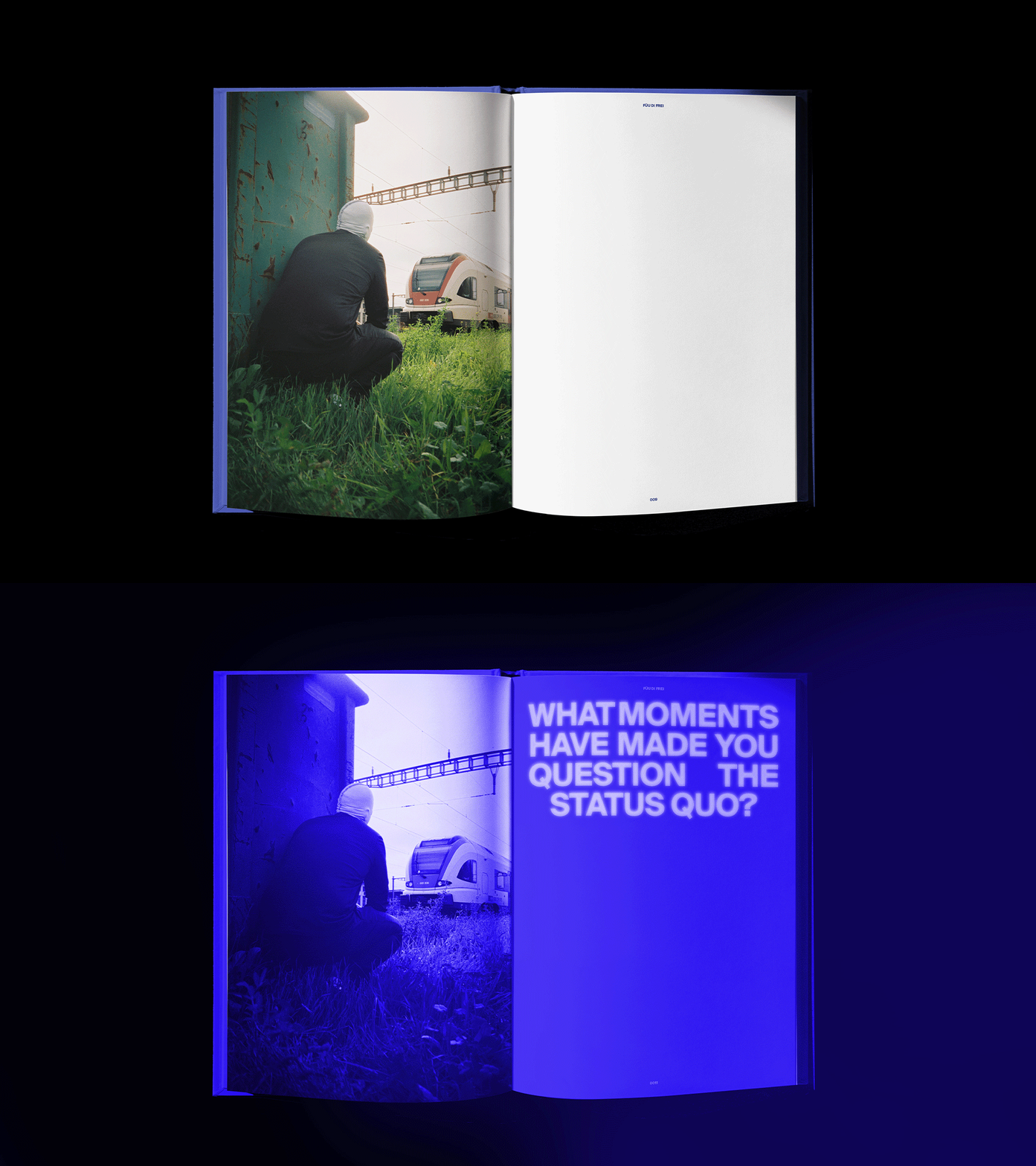
This GIF showcases a part of the book featuring questions and key words that define the project, visible only under ultraviolet light (UV ink).


Within the framework of crowdfunding, a unique opportunity to support this creative project financially arises. It includes the production of the book, the layout, the revision and the translation, as well as travel and subsistence expenses, and the corresponding 4% VAT on cultural initiatives. In addition, it is important to consider the costs linked to the Verkami platform, which are part of the funding process too. Funding is essential as it guarantees the continuity of our work when it comes to narrating meaningful stories and creating pieces that aim to resonate within the culture. As well as enabling the production of a tangible piece, contributing to this project also enhances a space for reflection and fosters conversation on relevant topics within society.
Every copy will be signed and dedicated and then delivered by hand in Barcelona or Bern, excluding national (Spain & Switzerland) and international shipments.
Info Book:
Limited edition 500 copies
Content: Over 250 pages
Prologue by RosyOne & Still Alive
Language: English
Format: 17 x 24cm closed / 34 x 24cm open
Interior: Full color (4 + 4) / Classic Rough 120 gsm paper
Endpapers: 4 + 0 colors / Classic Rough 150 gsm paper
Cover: 4 + 0 colors with dry stamping (14x14cm) / Geltex White Silk 125 gsm paper
Binding: Swiss binding with exposed thread and painted edges on all three sides
Board: 2.5mm thick cardboard
More info: [email protected]


4 comentarios
Si ya eres mecenas, Inicia sesión para comentar.
Enrico
My adress: Enrico Squassina. via x giornate 24 Provaglio d' Iseo. Bs 25050 Italy
traviscassel
diiiiiselo primitooo a gas con eso!!!!
cream company
🏴☠️
Teresa Morales Ollé
¡Con muchas ganas de tenerlo!